If you’ve used PicLumen for a while, you’ve probably had this moment: you clearly know what you want, you type it in, and the result comes out completely off. You imagine a cinematic cyberpunk scene, but the image looks flat or random. You picture something warm and soft, but it turns cold and lifeless.
That gap is frustrating, but it’s also the key. Most of the time, the problem isn’t the tool—it’s how we communicate with it. AI doesn’t “understand” vague ideas. It follows a structure. And once you start giving it structured instructions instead of loose descriptions, everything changes.
This is where a simple idea helps: stop writing prompts like casual sentences, and start building them like formulas.
The Core Idea: Prompts Are Recipes, Not Descriptions
Instead of typing whatever comes to mind, think in layers. A reliable prompt usually follows this structure:
Subject + Style + Lighting + Material + Color + Composition / Camera
This isn’t about making prompts longer. It’s about making them clearer.
Compare these two:
a cat
versus
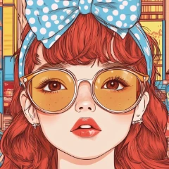
a fluffy orange cat, watercolor painting style, outlined by warm backlighting, lying on a soft felt blanket, soft warm tones, close-up shot
 |  |
|---|
The second one works better, not because it’s longer, but because each part tells the AI something specific. You’re no longer hoping for a good result—you’re assembling one.
Lighting: The Fastest Way to Fix a “Flat” Image
When an image feels off, lighting is often the missing piece. It controls depth, mood, and realism all at once.
There are two layers to think about. The first is foundational lighting, which sets the structure of the image—things like rim lighting to outline a subject, side lighting to create contrast, backlighting for atmosphere, or studio lighting for clean and soft results. These are the basics, and they already make a big difference.
Then there’s effect lighting, which shapes the emotion. Cinematic lighting gives you that film-like depth. Volumetric lighting and the Tyndall effect add visible light beams in fog or air. Neon and laser lighting push things toward a futuristic look. Bioluminescence introduces a subtle, almost magical glow.
What matters isn’t just choosing one, but combining them with intent. A mysterious scene might lean on atmospheric lighting plus bioluminescence. A sci-fi setting often works better with neon, glow effects, and volumetric light together. Once you start thinking this way, lighting stops being a detail and becomes a tool.
Color and Style: Where Mood Actually Comes From
If lighting builds the structure, color defines how it feels.
Soft tones create something gentle and comfortable. Morandi palettes—those muted gray-blue or low-saturation colors—instantly make an image feel more refined. On the other hand, neon or complementary colors (like red and green) create strong contrast and energy, which is why they show up so often in cyberpunk visuals. Warm tones feel inviting and human, while cool tones feel distant or futuristic.
The difference is often subtle in wording but big in results. “Blue tone” is vague. “Muted Morandi blue-gray tone, calm and refined” gives the AI a much clearer direction.
Style works alongside color. A watercolor style gives you softness and natural blending, oil painting adds weight and texture, ink wash creates a minimal and poetic feel, while airbrush effects smooth everything out. These aren’t just aesthetic choices—they change how the entire image is rendered.
Materials and Design: The Details That Make It Feel Real
A lot of prompts fail not because the idea is wrong, but because the image lacks physical presence. That’s where materials come in.
Describing something as liquid metal instantly adds motion and a futuristic edge. Holographic foil introduces reflection and color shifts. Felt textures make things soft and playful, while acrylic and aluminum materials bring in a clean, product-like realism. These small additions are often what turn an image from “AI-generated” into something believable.
Design style quietly shapes everything underneath. Flat design works well for icons and UI. Skeuomorphic styles mimic real objects. Cubism breaks things apart into multiple perspectives. Art Nouveau adds flowing, organic curves. Modern minimalism and Nordic styles keep things simple, bright, and functional.
You don’t always notice these choices—but the AI does.
A Simple Walkthrough: From Idea to Controlled Result
Let’s take a basic idea and build it properly.
Start with something minimal:
future city at night
This gives you a direction, but not much control. Now add structure:
cyberpunk future city, neon lights illuminating the streets, volumetric lighting through fog, cool color tones, low-angle perspective
Already, the image becomes more predictable. Then refine it further:
cyberpunk future city at night, neon lights and laser beams intersecting, strong Tyndall effect visible in the air, buildings with liquid metal surfaces, cinematic lighting, low-angle composition, high-contrast complementary colors
At this point, you’re not guessing anymore. You’re directing.
The Shift That Changes Everything
Most people stay stuck asking why the AI image creator doesn’t understand them. The better question is whether the idea was clearly broken down in the first place.
Once you start using prompts as structured combinations—lighting, color, material, style—you gain control piece by piece. If something looks wrong, you know which part to adjust. It stops feeling random.
And that’s really the shift: from “why can’t it generate this?” to “which part of my prompt needs tuning?”
Open PicLumen again and try building your next prompt like a recipe instead of a sentence. You’ll probably notice the difference faster than expected.