AI image models have reached a point where generating a “good-looking” product image is easy.
What’s still difficult is creating something you can actually use—something that feels like a real marketing banner, not just a polished visual.
This is especially true when working with image-to-image workflows, where the goal is not just to generate, but to transform existing visuals into structured, campaign-ready assets.
The difference usually comes down to one thing:
style selection and structure, not just prompt detail.
Below are three highly effective banner directions—each built for a different marketing goal—and how to guide AI toward them.
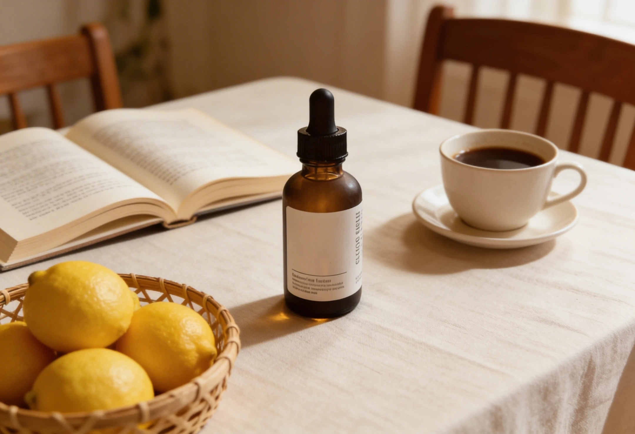
1. Luxury Skincare Banner: Designed for Trust

High-end skincare visuals don’t compete for attention.
They create space, clarity, and a sense of control.
In this type of banner, the product is not just present—it is the visual anchor. Everything else exists to support it. Lighting becomes softer, colors become quieter, and composition becomes intentional.
Instead of “decorating” the image, the goal is to translate product benefits into visual form. Ingredients like aloe, shea butter, or botanical extracts aren’t just added—they are positioned to reinforce credibility.
This is where multi-image prompting becomes powerful. When each element is clearly defined—what is the product, what are the supporting ingredients, what defines the atmosphere—the model can produce something that feels structured rather than assembled.
The result is not just a product image, but a brand-level visual that communicates quality and trust.
2. Playful E-commerce Banner: Designed for Clicks

Not every banner needs to feel premium.
Some need to perform.
Playful e-commerce visuals—especially for cosmetics—lean into energy rather than restraint. Bright colors, layered elements, stickers, icons, and exaggerated typography all serve one purpose: capture attention quickly.
What makes this style particularly effective with AI is that it is more forgiving.
Minor inconsistencies or visual noise often read as intentional design choices rather than mistakes.
Typography becomes louder. Layout becomes more dynamic. A clear call-to-action, such as “Shop Now,” turns the image from decorative into functional.
This is the kind of banner built for social feeds—fast, eye-catching, and optimized for engagement rather than subtlety.
3. Style Matching: The Most Overlooked Factor
Matched | Unmatched |
|---|---|
 |  |
One of the most common issues in AI-generated marketing visuals is not technical—it’s conceptual.
A banner structure that works for one product category may completely fail for another.
For example, applying a playful, high-energy e-commerce layout to a premium skincare serum often leads to a mismatch. The visual language conflicts with the product’s intended positioning. Instead of enhancing the product, the design weakens it.
Luxury skincare relies on calmness, texture, and trust.
Playful cosmetics rely on color, movement, and stimulation.
When these signals are mixed, the result feels off—even if every individual element looks correct.
This is where many AI-generated banners fall short:
not because the model fails, but because the design context is undefined or misaligned.
What Actually Improves AI Banner Results
Instead of relying on longer prompts, better results usually come from clearer structure and intent.
Optimization Direction | Adjustment | Result | Key Reason |
|---|---|---|---|
Define the main subject | Explicitly set product as focal point | ✅ Strong improvement | Establishes visual hierarchy |
Multi-image composition | Assign clear roles to each element | ✅ Stable results | Prevents random blending |
Limit human presence | Use hands instead of full figures | ✅ Effective | Reduces complexity |
Style definition | Specify “luxury” or “playful” clearly | ✅ Critical | Guides design direction |
Add CTA elements | Include buttons or action text | ✅ More realistic | Enhances marketing function |
Cross-style usage | Apply wrong style to product | ❌ Negative | Breaks visual consistency |
A Simple Way to Think About It
AI doesn’t struggle with rendering anymore.
It struggles with decision-making.
When too many elements, styles, or instructions are introduced at once, the output becomes unstable. The result often feels visually correct but structurally wrong.
The more clearly you define:
what kind of banner this is
what role each element plays
what style the design belongs to
…the more consistent the outcome becomes.
In practice, this means that improving results is less about adding detail, and more about removing ambiguity.
Final Thought
AI can already generate images that look like marketing materials.
But to create something that actually works as a banner, you need to approach it like a designer.
Not by asking:
Can this model generate a good image?
But by deciding first:
What kind of banner am I trying to create?