Chargement...

catali_es_yufei
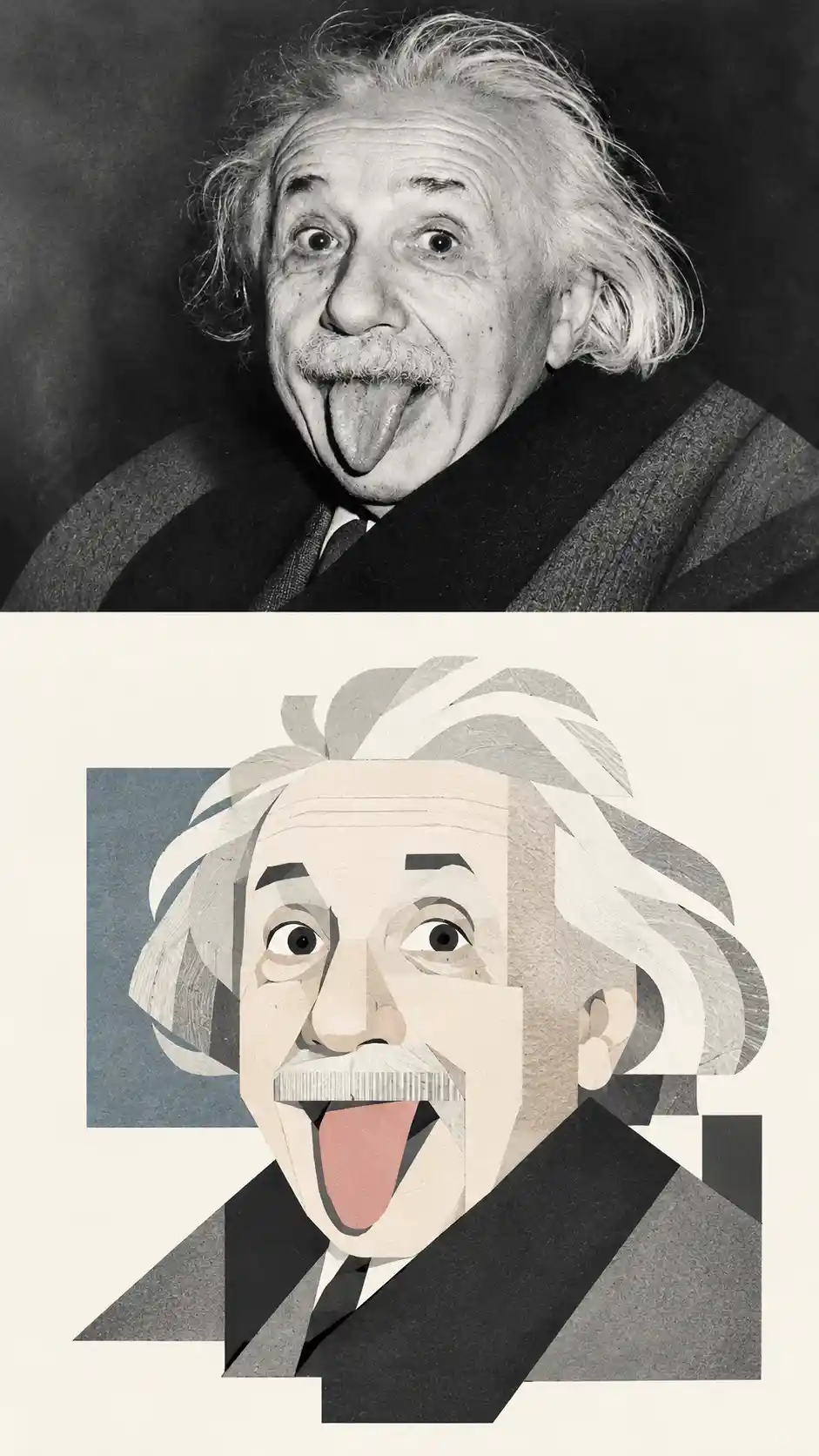
Affiche portrait avec photo scindée et illustration géométrique - Art IA | PicLumen
Prompt
This is a high-end vertical poster design, with each uploaded photo created as a separate draft, avoiding multiple image stitchings. The top and bottom of the image are strictly 1:1, each occupying 50%. The upper half retains the original photo, preserving the subject's identity, structure, posture, realistic texture, natural lighting, and original color atmosphere, with only slight advanced color adjustments to achieve the quality of an art magazine or exhibition image. The environment can be naturally expanded to fit the frame, but the subject must not be stretched, distorted, or altered. The lower half extracts the most recognizable subject, outline, structure, posture, and narrative relationship, reconstructing it into a blocky, modular geometric deconstruction illustration. It does not completely copy or realistically depict; irrelevant details are removed, retaining only the most representative visual memory points of identity and style. The image is reconstructed through geometric generalization, shape layering, and collage, allowing the viewer to immediately recognize the photo above. The design emphasizes a blocky, modular feel, geometric segmentation, and large, complete planes. The breakdown should not be overly fragmented, avoiding numerous scattered small pieces; instead, the subject is organized using fewer, larger, and more complete rectangles, squares, rounded cubes, ellipses, triangles, and irregular planes. Human figures can have square faces, clear jawlines, and blocky facial features; architecture is transformed into a single, square volume, with distinct facade sections, rhythmic window openings, and structural transitions; animals, plants, objects, and landscapes are similarly refined into geometric shapes within a blocky order. Moderate exaggeration is permissible, but must be mature, restrained, and concise, avoiding triviality, childishness, and overly scattered composition. The composition employs flat color blocks + collage structure + modernist geometric language. Color blocks are pieced together like paper scraps, creating a distinct and orderly collage feel; complex backgrounds are removed, leaving only a few necessary shapes, avoiding the formation of a secondary center. The composition maintains a small-scale subject/large areas of white space, freely arranged according to the subject's direction, proportion, center of gravity
Model
GPT-Image-2
Date created
09/08/26 at 12:45 PM
Seed
847487076
Guidance Scale
7.5
Resolution
941 x 1672
Related images