AI image generators are getting much better at realistic photography, especially with faces, hands, and everyday environments. The differences between current tools are often smaller now, and they tend to show up in skin texture, lighting, background detail, and how closely the image follows the prompt.
So, what is the best AI to generate realistic photos? Based on our same-prompt portrait test, PicLumen and Grok gave the most natural documentary-style results, while Higgsfield added more candid character and Midjourney pushed the scene in a more cinematic direction.
To compare them fairly, we used the same documentary portrait prompt across 8 popular tools: PicLumen, Grok Imagine, OpenArt, Magnific, Higgsfield Soul 2.0, Recraft, Krea, and Midjourney. We then looked at the generated images side by side, focusing on facial realism, lighting, scene accuracy, and prompt fidelity.
8 AI Image Generators at a Glance
The order below is not a ranking.
Tool | Look in Our Test | Main Change From the Prompt | Good Fit For |
PicLumen | Natural documentary portrait | Very few changes | Mixed realistic image workflows |
Grok Imagine | Soft, understated photography | Very few changes | Natural portraits and lifestyle images |
OpenArt | Crisp and detailed | Minor texture differences | Detailed multi-model generation |
Magnific | Clean and polished | More controlled composition | Marketing and commercial visuals |
Higgsfield Soul 2.0 | Candid editorial photography | Cap and direct-flash lighting | People, fashion, editorial |
Recraft | Art-directed photography | Stronger directional light | Advertising and commercial work |
Krea | Busier environmental portrait | Extra person and scene elements | Creative exploration |
Midjourney | Cinematic portrait | Stronger light and depth of field | Editorial and atmospheric images |
The Prompt We Used
Each tool received the same prompt:
Documentary portrait of a 76-year-old fisherman standing outside a small weathered harbor house at dawn, deeply lined face, sun-damaged skin, grey stubble, slightly watery eyes, rough hands resting on a wooden railing, faded navy jacket with visible wear, cold sea air, pale morning light, fishing boats softly blurred in the background, honest expression, realistic wrinkles and skin variation, natural posture, environmental portrait photography, 50mm lens, restrained colors, no skin retouching, authentic documentary realism.
The subject gives us several details to inspect. An elderly face makes skin smoothing and excessive texture easier to notice. The hands rest against an object, while the jacket needs believable fabric and wear. Boats, railings, and harbor buildings add enough background structure to reveal obvious scene errors.
We did not add terms such as masterpiece, 8K, best quality, or award-winning. They do not describe the photograph itself and can push some generators toward a more polished style.
1. PicLumen
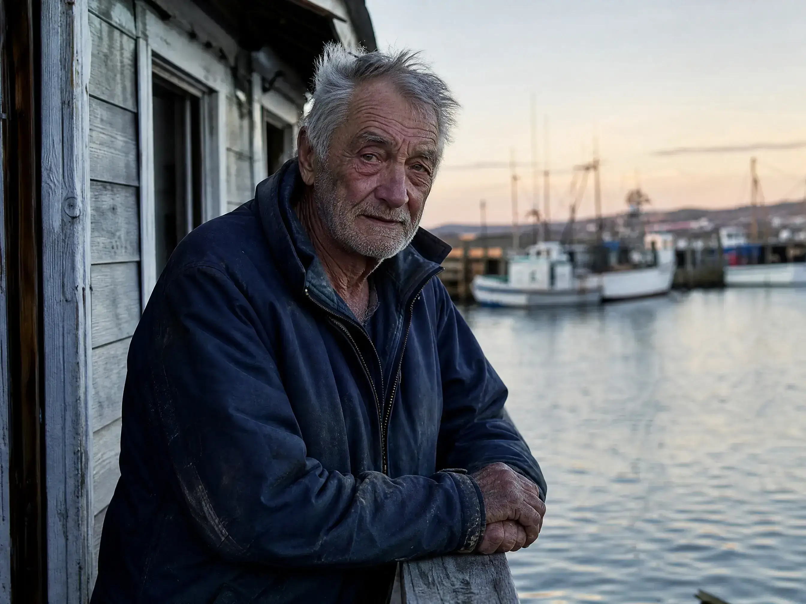
PicLumen result generated with the documentary fisherman prompt
PicLumen followed the prompt closely. The fisherman has visible age around the eyes, forehead, cheeks, and hands, while the skin stays relatively restrained.
The jacket also looks worn in a believable way. The boats remain recognizable behind him, and the lighting stays close to the pale morning atmosphere described in the prompt.
Zooming in shows slightly strong facial sharpening in a few areas. It is more noticeable around the wrinkles and beard, though it does not change the overall look of the image.
We also saw little scene drift. The fisherman, railing, harbor building, clothing, and background boats all remained close to the original description.
PicLumen is a multi-model platform rather than a single image model. That setup is useful for people who generate portraits one day and product or lifestyle images the next, since different models can be used without moving the project to another platform.
2. Grok Imagine
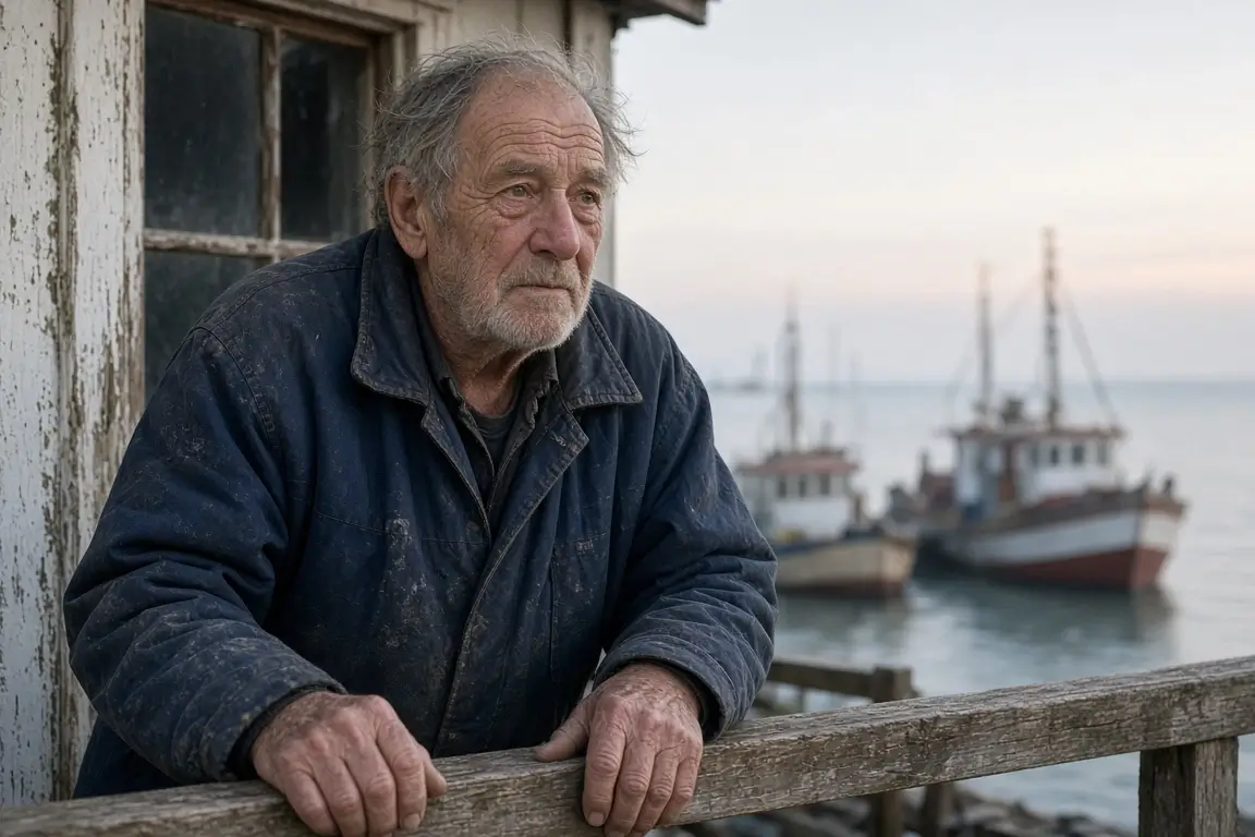
Grok Imagine used softer facial detail and restrained morning light
Grok Imagine produced one of the softer images in the group.
The skin has less aggressive detail than OpenArt or Higgsfield. Wrinkles are visible, but they do not dominate the face. The muted lighting also fits the harbor setting well.
The hands and distant boats lose some definition when viewed closely. At a normal viewing size, the softer rendering looks similar to a lightly processed documentary photo.
Grok also stayed close to the requested composition. It did not introduce major clothing, lighting, or background changes.
For portraits where a clean but understated photographic look is more important than maximum texture, this result worked well.
3. OpenArt
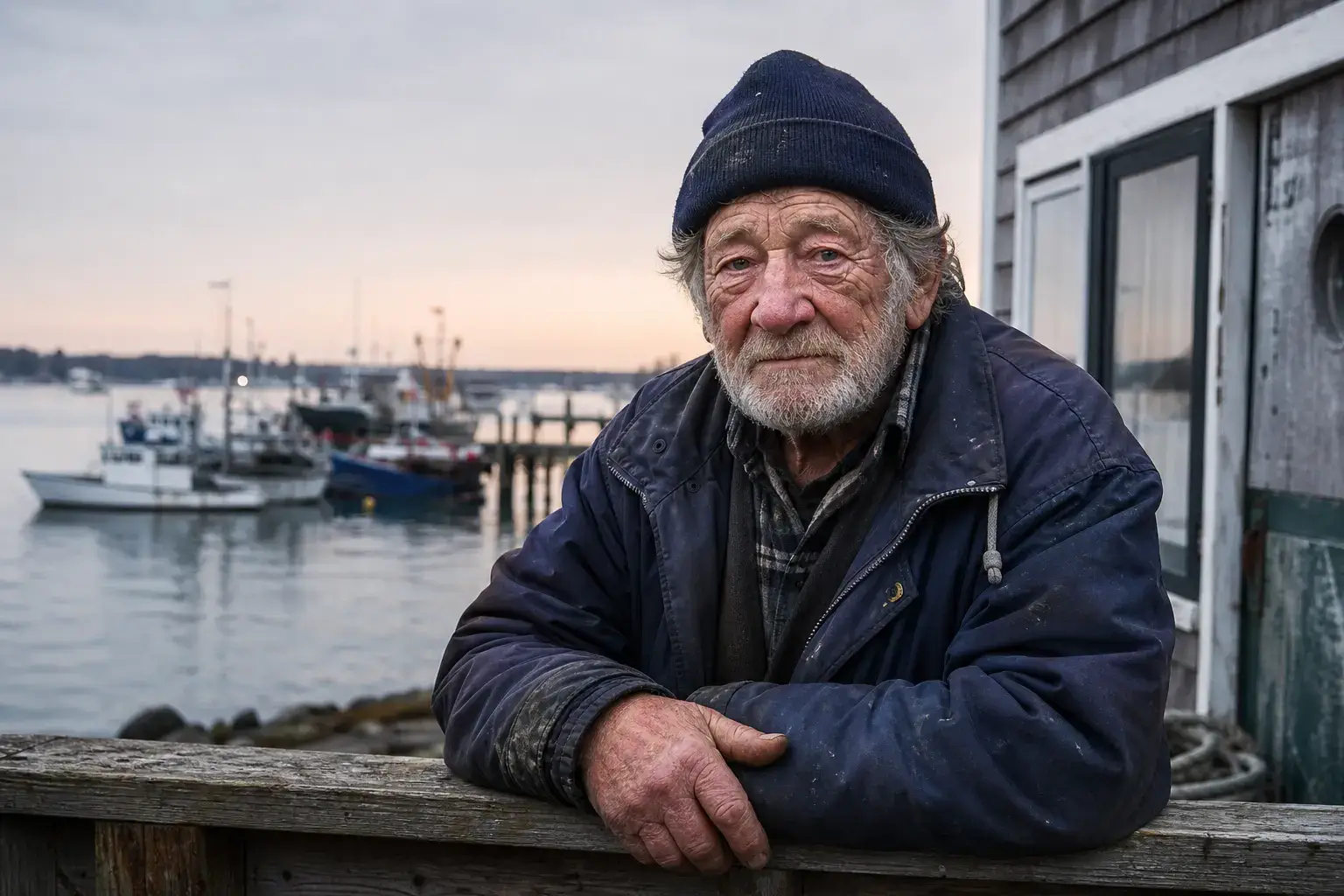
OpenArt rendered more visible facial and beard detail
OpenArt put more emphasis on detail.
Wrinkles, grey facial hair, jacket texture, and the edges around the face are clearly defined. The harbor remains readable without becoming too busy.
The facial texture becomes more noticeable at full size. Some areas around the beard and skin look processed compared with Grok's softer output.
There were few obvious changes to the scene itself, so the result remained close to the prompt.
OpenArt is also useful for people who want to compare several image models inside one platform. The test image shows only one workflow, so results can vary depending on the model selected.
4. Magnific
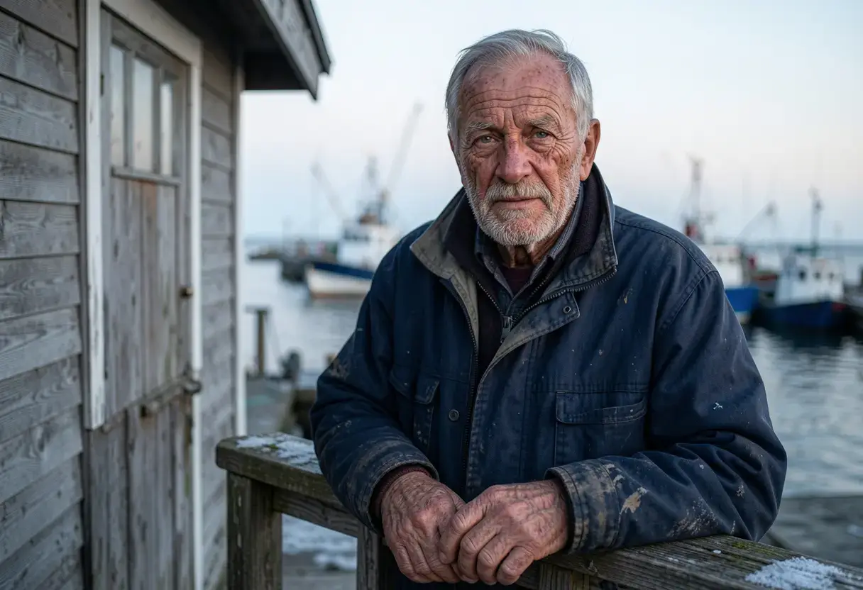
Magnific produced a cleaner, more controlled version of the harbor portrait
Magnific's image is tidy and technically stable. The face, hands, jacket, and boats do not show obvious structural problems.
The composition feels more planned than the Grok or PicLumen images. Background separation is clean, the subject sits neatly in the frame, and the overall finish looks suitable for editorial or branded content.
There is less of the rough, incidental detail often found in documentary photography. For commercial work, that cleaner presentation can be useful.
Magnific would make more sense for a campaign or polished lifestyle image than for someone trying to reproduce the look of an unedited harbor snapshot.
5. Higgsfield Soul 2.0
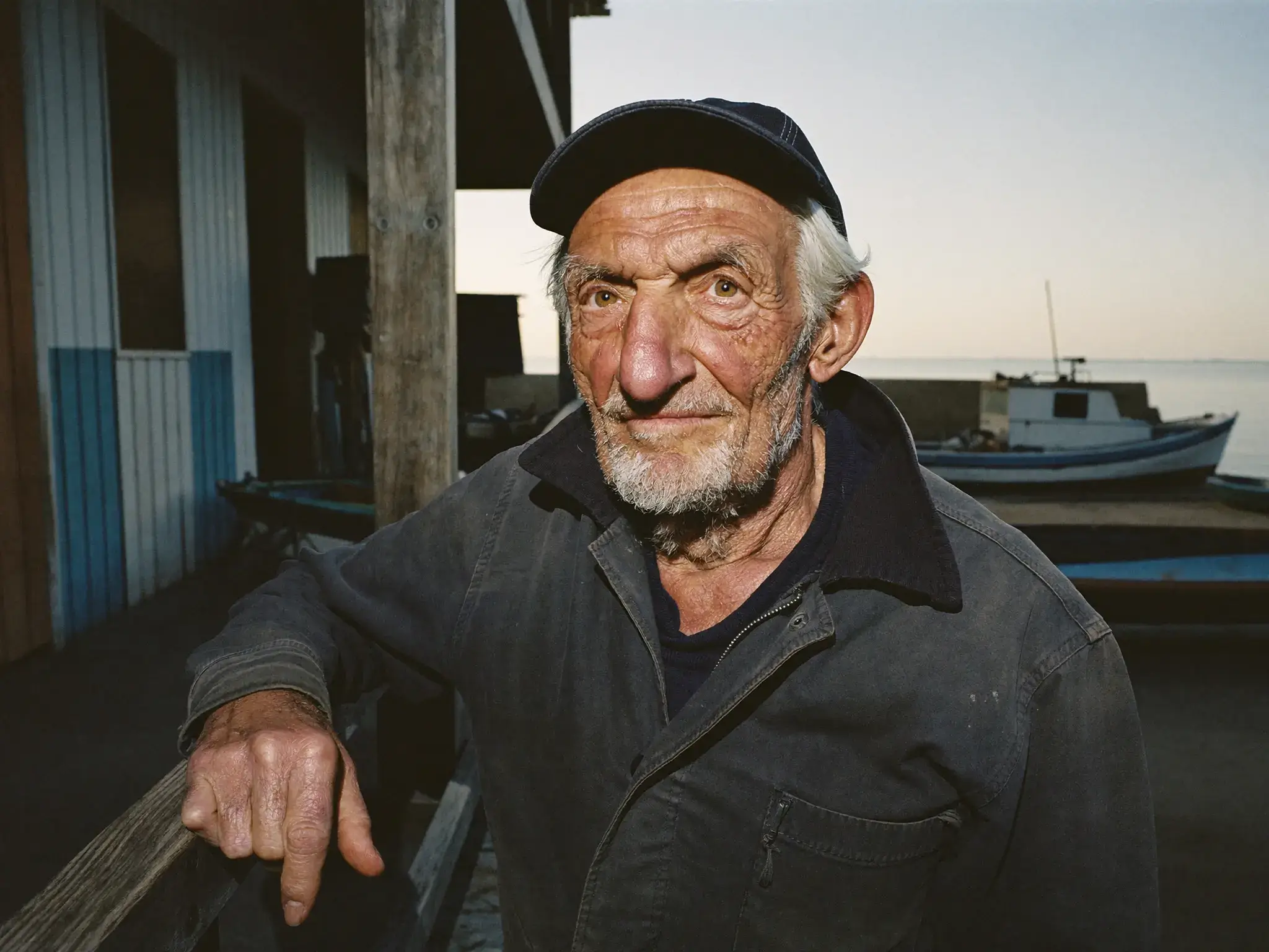
Higgsfield changed the lighting and added a cap, giving the image a stronger candid-photo look
Higgsfield made the biggest stylistic change to the person.
The soft dawn light from the prompt became harder and more direct. The fisherman also gained a cap. Those changes reduce prompt accuracy, but the resulting face is highly convincing.
The skin has uneven texture, the beard feels natural, and small asymmetries around the face make the subject look less polished. His expression also feels more like a captured moment than a standard generated portrait.
The image has a stronger editorial character than the quieter results from Grok or PicLumen.
Soul 2.0 is particularly interesting for fashion, character, and people-focused work. In those cases, the stronger photographic interpretation may be useful even when it moves away from the exact wording of a prompt.
6. Recraft
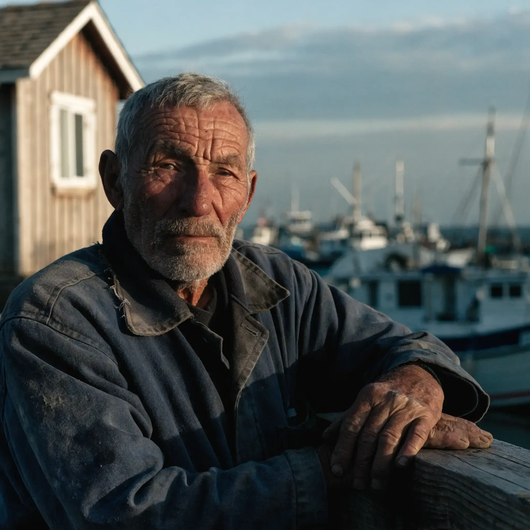
Recraft used stronger directional lighting while keeping the subject and harbor coherent
The strongest part of the Recraft image is the lighting.
It shapes the fisherman's face more deliberately and gives the portrait clearer separation from the background. Skin, hands, and clothing remain convincing, with no major anatomy problems visible in the result.
The light is stronger than the pale dawn treatment requested, so the image feels more art-directed.
That style fits commercial portraiture well. Advertising and product-related images often benefit from clearer lighting and composition, even if the final result feels less like an unplanned documentary frame.
7. Krea
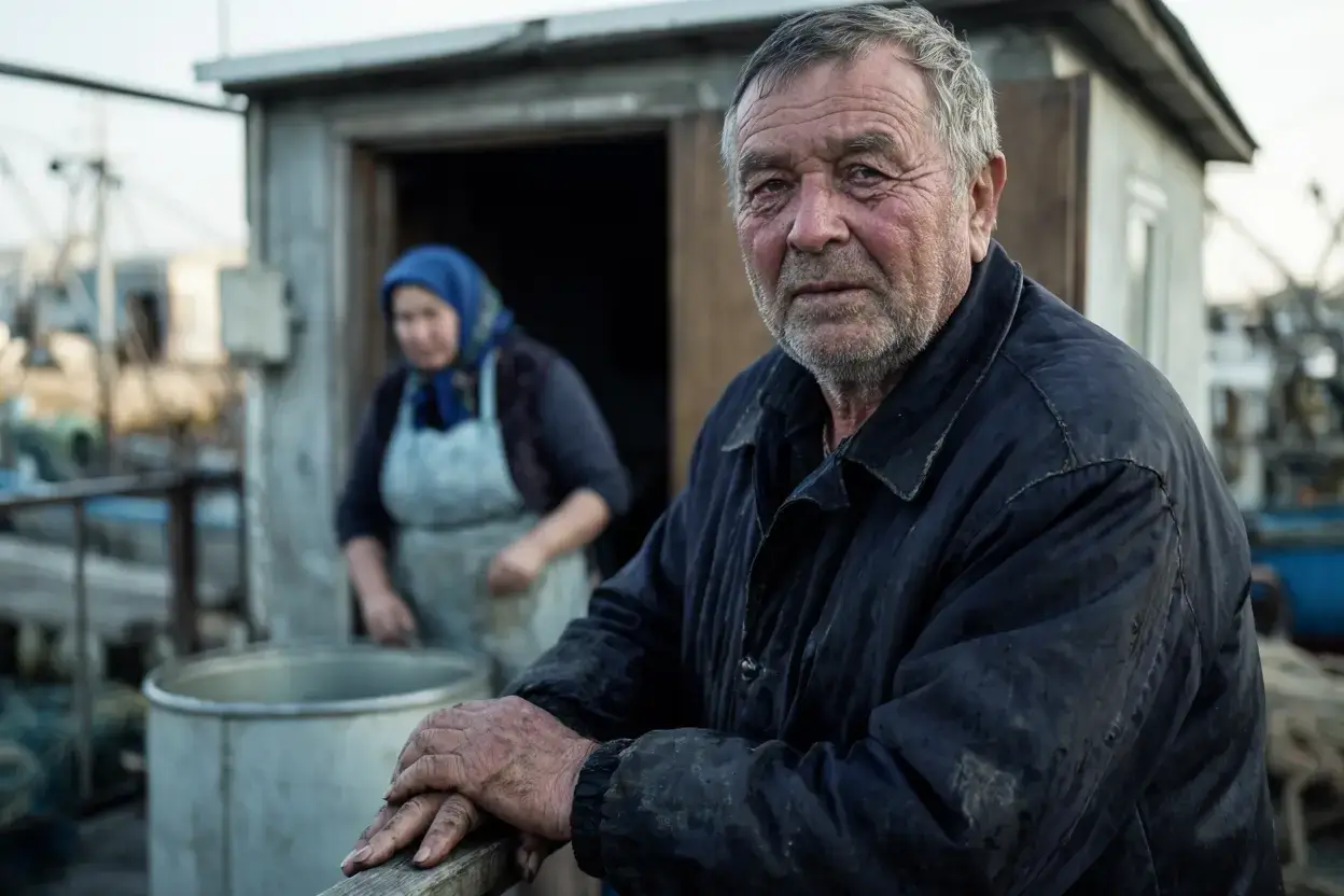
Krea introduced another person and more objects into the background
Krea expanded the scene more than the other generators.
The main fisherman remains intact, but another person appears behind him along with more harbor equipment. The additions are believable within the location, although none of them were requested.
The extra activity gives the image a stronger environmental feel. It also makes Krea less accurate to the original composition.
Facial detail is softer than OpenArt or Higgsfield, and the main subject looks slightly more generated when enlarged.
For exploratory work, the additional interpretation may not be a problem. It becomes more relevant when a scene needs to follow a specific layout or contain only the requested people.
8. Midjourney
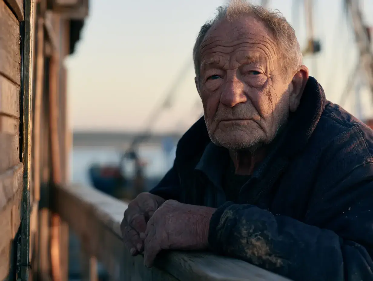
Midjourney introduced warmer directional light and stronger background separation
Midjourney changed the mood more than the basic subject.
The fisherman, clothing, and harbor remain recognizable, but the lighting is much more dramatic. The face receives stronger directional light, while the shallow depth of field separates the subject clearly from the boats behind him.
It looks closer to an editorial portrait or film still than the quieter documentary image described in the prompt.
Skin and clothing hold up well, so the issue is not basic realism. The main difference is photographic style.
People looking for cinematic portraits or atmospheric realistic imagery may prefer this treatment. A stricter documentary brief would favor one of the more restrained outputs.
All 8 Results Side by Side
A side-by-side view makes the differences clearer without reducing them to one score.
Tool | Face and Skin | Lighting | Scene Changes |
PicLumen | Natural, slightly sharp | Soft | Few |
Grok | Softer and restrained | Soft | Few |
OpenArt | Crisp, highly detailed | Neutral | Few |
Magnific | Clean and polished | Controlled | Minor |
Higgsfield | Irregular and photographic | Direct flash | Several |
Recraft | Natural | Strong directional light | Some |
Krea | Softer | Fairly natural | Added person and objects |
Midjourney | Detailed | Cinematic | Stronger styling |
The table records visible differences from this prompt. It is not meant to rank the tools from first to eighth.
A food photo would test texture and steam. A product image would put more pressure on geometry, packaging, reflections, and text. A crowded street scene would tell us more about multiple people and background consistency.
What Changed Most Between the Results?
Skin and Facial Detail
OpenArt rendered the most visible facial texture among the cleaner documentary-style results. Grok was noticeably softer. Higgsfield combined detailed skin with harder light, giving the face a rougher photographic character.
PicLumen kept the skin fairly detailed without moving as far toward either extreme.
The differences become easier to see around the cheeks, eye area, forehead, and beard rather than from the face as a whole.
Prompt Changes
Major anatomy errors were rare in this set.
The more obvious differences came from additions or styling changes. Higgsfield added a cap and changed the lighting. Krea added another person and more objects. Midjourney used a more cinematic light treatment.
These changes would matter more in a commercial brief where clothing, number of people, or scene layout needs to stay fixed.
Lighting
Grok and PicLumen stayed relatively close to the requested pale morning light.
Magnific made the scene cleaner and more controlled. Recraft used stronger directional light. Higgsfield switched to a harder flash look, while Midjourney gave the portrait the most dramatic lighting of the group.
Choosing between them depends partly on the type of photograph you want rather than realism alone.
Why Do Some Realistic AI Photos Still Look Artificial?
Skin is still one of the easiest places to inspect. Overly smooth skin looks synthetic, but uniform pores and extremely sharp wrinkles can also look processed.
Hands have improved considerably. Checking how they touch another object is often more useful than simply counting fingers. Fingers should wrap around a cup, railing, phone, or piece of clothing in a physically plausible way.
Background objects deserve the same attention. Boats, windows, ropes, jewelry, signs, furniture, and distant people can contain small errors even when the main face looks convincing.
Lighting should also stay consistent across the whole scene. Shadows, eyes, reflective materials, windows, and wet surfaces should respond to the same light sources.
These checks are more useful when judging a photorealistic AI image generator than simply looking at how sharp the final image appears.
Which Tool Would I Use for Different Jobs?
Based on this test and the way the tools are set up, I would not use exactly the same option for every project.
For a quiet documentary-style portrait, Grok and PicLumen stayed closest to the requested mood. Higgsfield Soul 2.0 would be more interesting when the person needs a stronger editorial or fashion-photography character.
Midjourney makes more sense when lighting and atmosphere are part of the appeal. Recraft fits commercial work that needs a more deliberate photographic treatment, while Magnific produced a clean finish suited to marketing visuals.
OpenArt, Krea, and PicLumen have an additional platform-level advantage: users can work with multiple image models rather than relying on one fixed visual approach. This becomes useful when the next project is a product photo or reference-image edit instead of another portrait.
The fisherman test only covers one type of realistic image, so those workflow differences should be considered separately from the visual result shown here.
FAQs
What is the best AI to generate realistic photos?
It depends on the subject and the photographic style you want. Grok and PicLumen stayed close to the documentary prompt in this portrait test. Higgsfield produced a more candid editorial look, while Midjourney gave the scene stronger cinematic lighting.
Why can an AI photo look real at first but fake when enlarged?
Small errors are less visible at thumbnail size. Full-size images can reveal overly uniform skin, strange hand contact, inconsistent reflections, or broken background objects.
The face is often the strongest part of the image, so checking smaller objects around the subject can be more revealing.
Is image-to-image better than text-to-image for realistic results?
Image-to-image has an advantage when you already need to preserve a specific person, pose, product, or composition. Text-to-image gives the model more freedom to design the scene from scratch.
If your goal is to convert pictures to hyperrealistic AI images while keeping the original visual structure, starting with a reference image usually gives you more control.
How to make realistic AI photos look more natural?
Describe the actual photograph you want. Useful details include the light source, time of day, camera distance, skin condition, clothing, environment, and materials.
Generic terms such as perfect quality, 8K, or masterpiece provide less useful visual information.
Can the same AI image generator handle portraits and product photos equally well?
Performance can change significantly by subject.
Portraits expose skin, hair, eyes, and anatomy. Product images require accurate shapes, materials, reflections, packaging, and often readable text. A tool that performs well with people may not be the strongest choice for every commercial product image.
What should I check when choosing the best AI image generator for realistic photos?
Look at full-size outputs rather than sample thumbnails. Check skin, hands, background objects, lighting consistency, and how closely the tool follows the requested scene.
If you work across several types of imagery, model choice, reference-image support, editing tools, and the wider workflow are also worth considering.